Volume UX Guidelines
In order to maximise your conversion rate and adoption among your customers, it's mission critical to focus on:
- Positioning of the Volume button at the checkout;
- Size of the Volume button with your UX and other payment method options;
Button Positioning
Where to display the button on iOS and Android mobile devices?
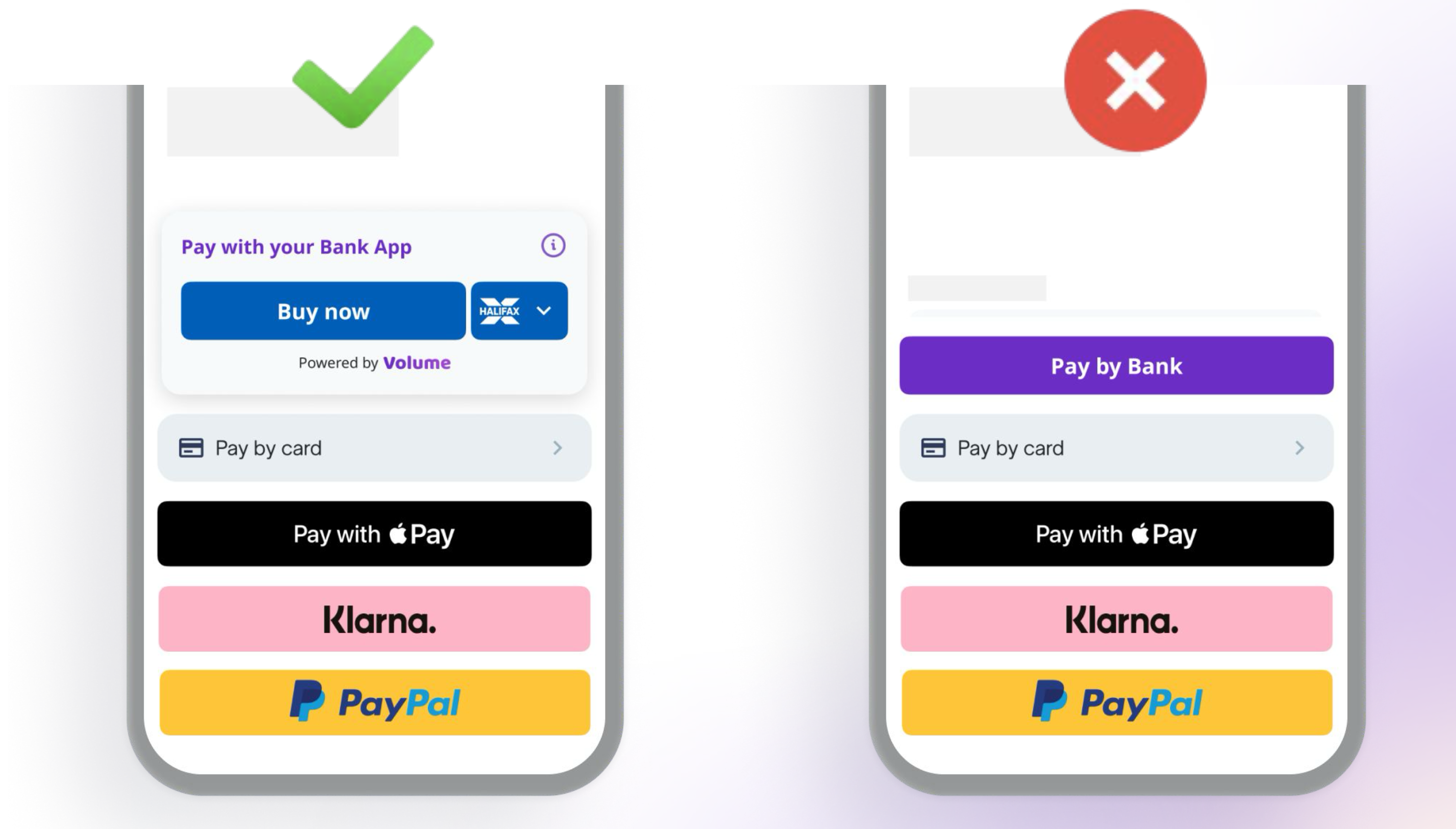
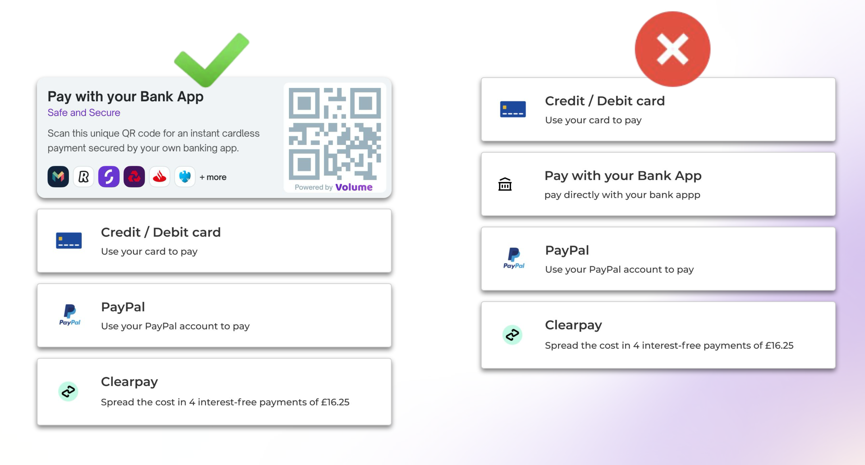
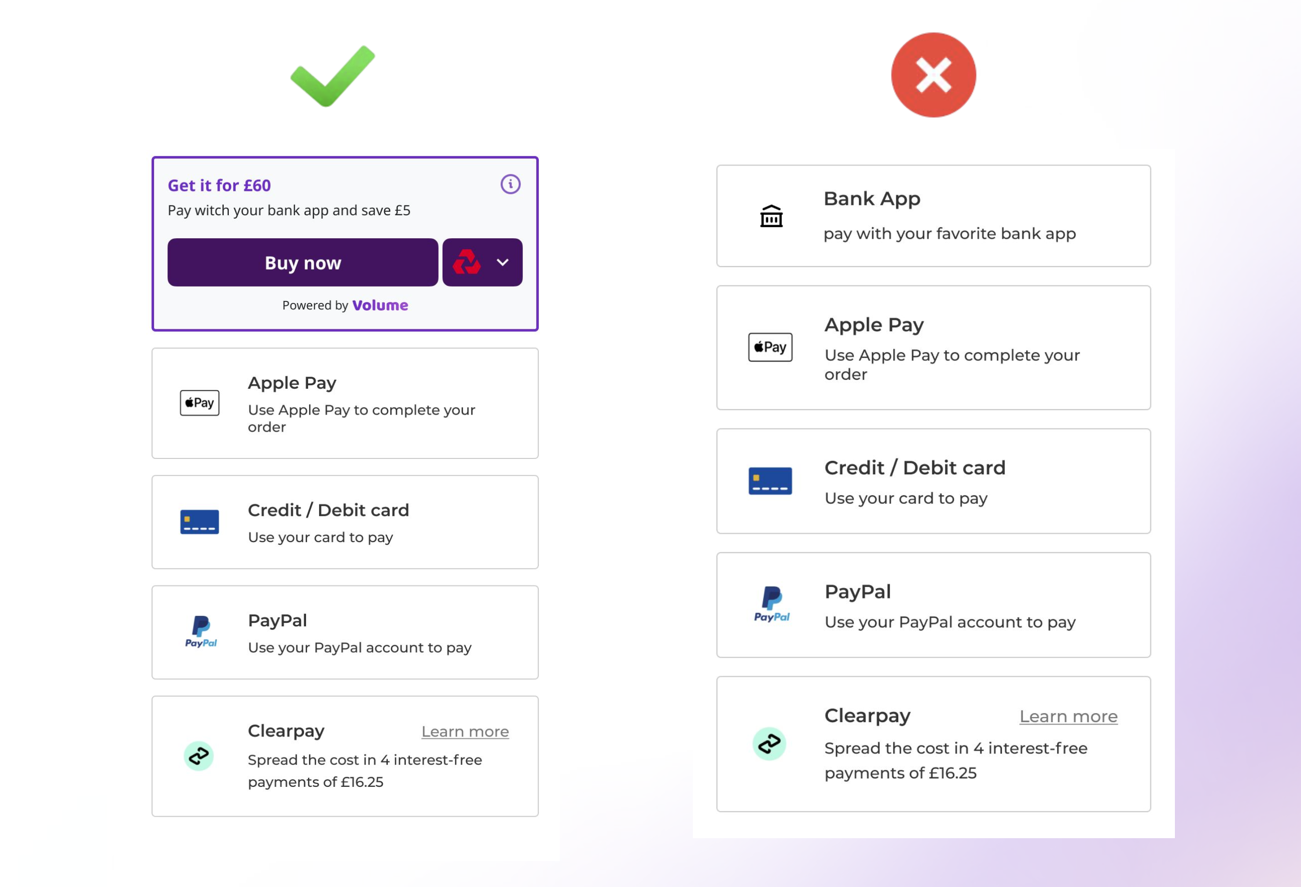
- Volume button is the top payment method at the checkout
- Your customers can straightaway see the brand of their favorite bank app
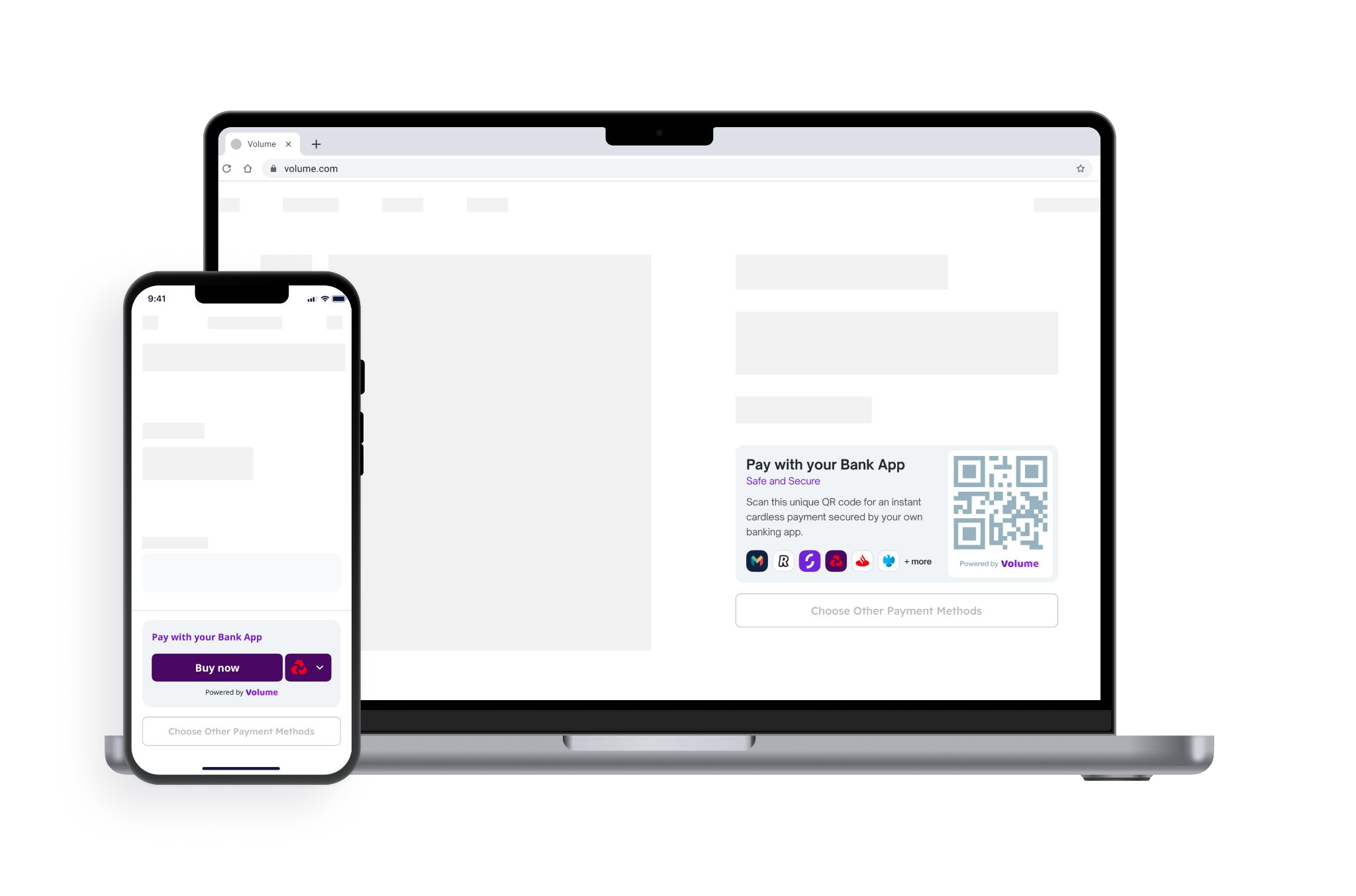
Where to display the button on web desktop?
- Volume button is the top payment method at the checkout
- The QR code is directly visible to your customers with the brands of their bank apps
Best practices to increase users adoption
- Volume is a pre-selected payment method among other options
- Your customers save at least £0.01 when the pay with Volume compared to traditional payment methods
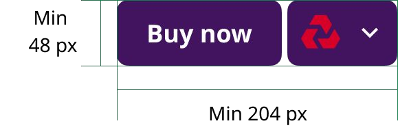
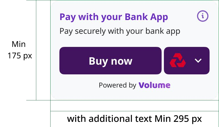
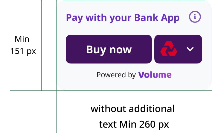
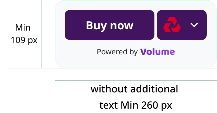
Button Sizing
Adjust the corner radius to match the appearance of other payment buttons. By default, Volume has rounded corners. You can change the corner radius to produce a button with square corners or a capsule-shape button.
Examples of good implementation
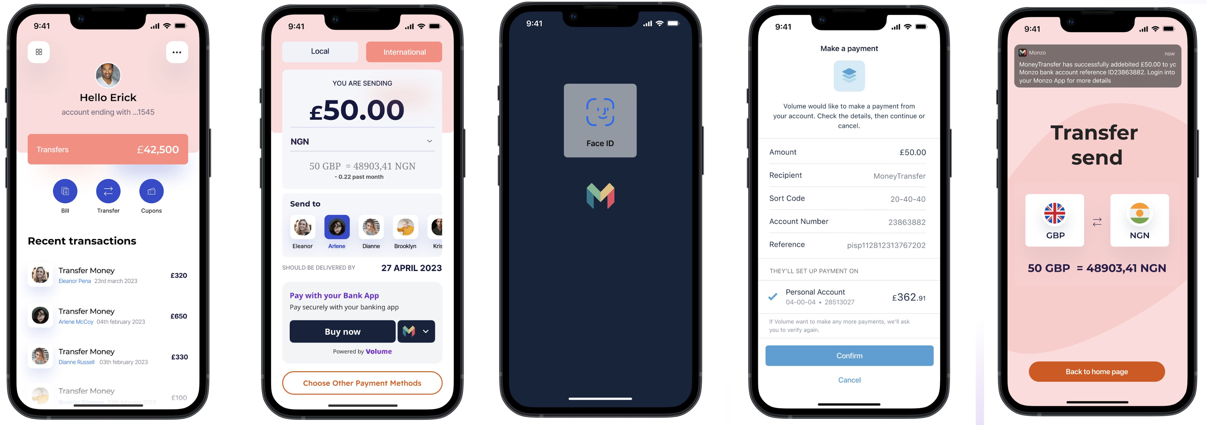
Money Remittances and Currency Exchange
Volume Trademark
Use Volume graphics to show that Volume is an available payment option when you show payment options to your users.